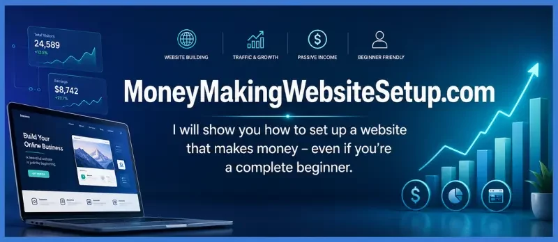
What Does a Business Website Actually Need to Look Professional?
Most people assume a professional business website starts with a designer.
It doesn’t.
A professional website starts with clarity.
Think about the last time you landed on a website and instantly trusted the business behind it. Chances are it wasn’t because the design was revolutionary. It wasn’t because the colors were perfect or the animations were impressive.
Something else happened first.
Within seconds, you understood who they were, what they offered, and whether they could help you.
That’s the real job of a business website.
If you’re building a website on a budget—or starting from scratch—you don’t need expensive software, a design agency, or months of planning. You need a website that answers the questions every visitor asks, often without realizing it:
- Can I trust this business?
- Am I in the right place?
- Can they solve my problem?
- What should I do next?
When those questions are answered quickly, visitors stay.
When they’re not, they leave.
Search engines notice that behavior.
Google’s systems are increasingly designed to measure satisfaction signals. A site that helps people find what they need tends to earn more engagement, stronger behavioral signals, and ultimately greater visibility.
That’s why this checklist isn’t really about building a website.
It’s about building confidence.
And confidence is what converts strangers into customers.
Why So Many Small Business Websites Feel Forgettable
There’s a pattern you’ll start seeing once you know where to look.
A local contractor launches a website.
A consultant spends weeks tweaking colors.
A new business owner buys a beautiful template.
Everything looks polished.
Yet the site feels strangely empty.
Visitors arrive.
Visitors leave.
Nothing happens.
The problem usually isn’t design.
The problem is direction.
Many websites are built around what the owner wants to say rather than what the visitor needs to know.
The result is a digital brochure instead of a business asset.
The websites that consistently generate inquiries, leads, and sales tend to follow a different philosophy.
They’re built around clarity.
Every section has a purpose.
Every page moves the visitor forward.
Every design decision supports trust.
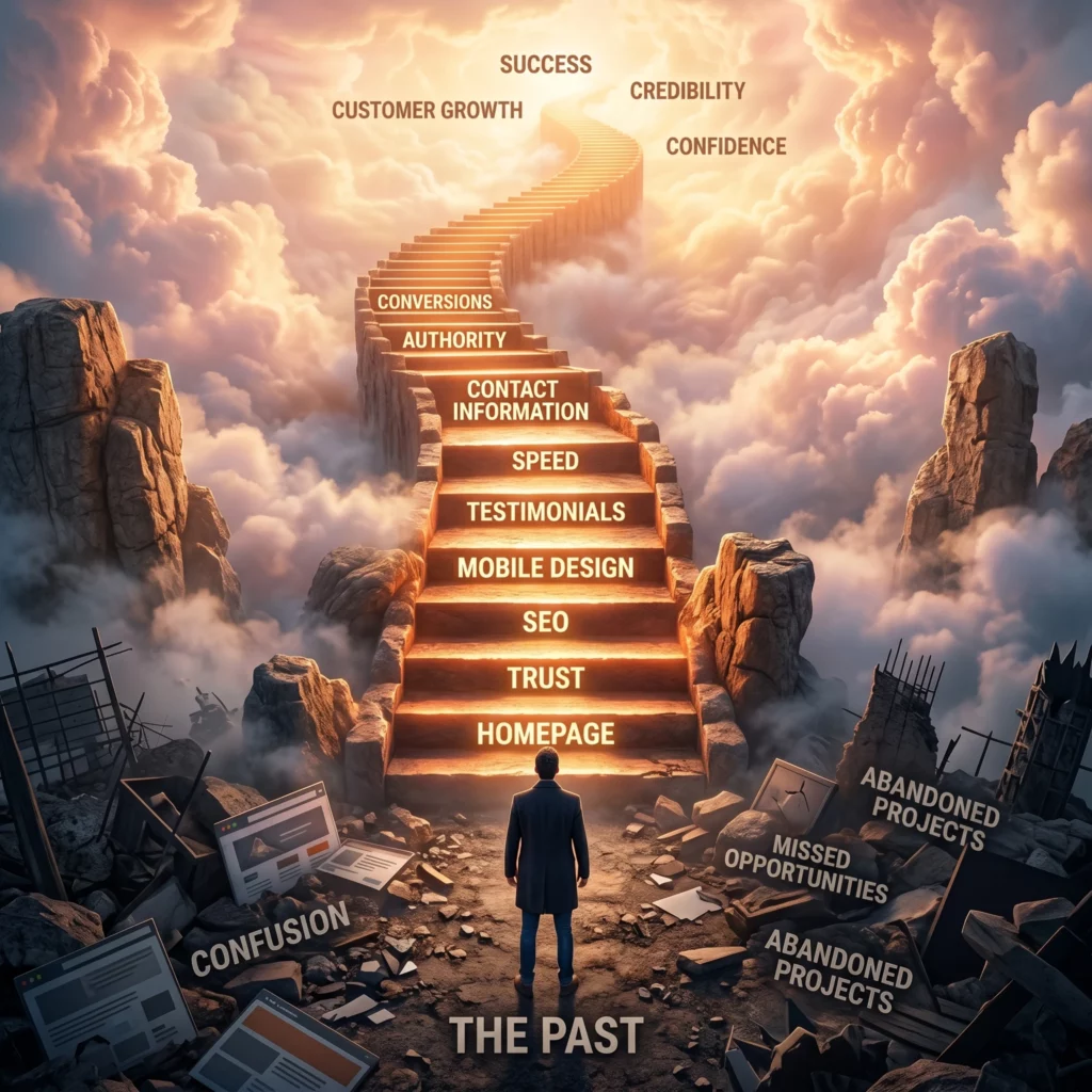
The 17 steps ahead are built on that foundation.
The Free Website Setup Checklist
Step 1: Decide What Your Website Is Supposed to Do
Before choosing a platform, before selecting a template, before writing a single line of copy, answer one question:
What is the primary purpose of this website?
It sounds obvious.
Yet this is where many websites quietly fall apart.
A site trying to book appointments, sell products, collect email subscribers, build authority, showcase a portfolio, and explain a business story all at the same time often ends up doing none of them particularly well.
Focus creates momentum.
Your website should have one dominant objective.
For example:
Generate Leads
Ideal for service businesses, agencies, consultants, and contractors.
Book Appointments
Perfect for coaches, therapists, dentists, and local professionals.
Sell Products
Best for ecommerce businesses and product-based brands.
Build an Email List
Effective for creators, educators, and personal brands.
Establish Authority
Useful for consultants, experts, and thought leaders.
Once your primary goal is clear, every page becomes easier to build because every decision can be measured against that objective.
If a section doesn’t support the goal, it probably doesn’t belong.
Step 2: Choose the Right Free Website Builder
The platform you choose isn’t the most important decision you’ll make.
But it does shape everything that follows.
A good website builder should feel like a helpful tool.
A bad one feels like you’re fighting the software every step of the way.
Several free website platforms stand out for different reasons.
Wix
Wix remains one of the most beginner-friendly options available.
It’s particularly useful for:
- Local businesses
- Service providers
- Freelancers
- Small companies launching their first website
The drag-and-drop experience is intuitive, which means you can spend less time learning software and more time building your business.
WordPress.com
If content marketing and SEO are long-term priorities, WordPress deserves serious consideration.
It’s especially effective for:
- Blogs
- Authority websites
- Educational businesses
- SEO-driven brands
The learning curve is slightly steeper, but the flexibility can be worth it.
Google Sites
Simple.
Fast.
Functional.
Google Sites works best when your goal is basic online visibility rather than advanced customization.
Carrd
Carrd has become a favorite among freelancers, consultants, and creators who need a clean one-page website.
For simplicity, it’s hard to beat.
Entity Connection
Website Builder → Content Management System → Hosting → Website Templates → Mobile Design → Search Engine Optimization → User Experience
The platform matters.
But what matters more is choosing one and moving forward.
Many businesses lose months comparing tools when they could have launched weeks earlier.
Step 3: Secure a Business Name That Sounds Like a Real Brand
A business name is more than a label.
It’s a memory trigger.
It’s how people search for you, recommend you, and recognize you.
A strong name creates instant credibility.
A weak one creates friction.
When evaluating potential names, ask yourself:
- Is it easy to pronounce?
- Is it easy to spell?
- Is it easy to remember?
- Can it grow with the business?
The strongest business names tend to feel obvious after you hear them.
Not complicated.
Not clever.
Just memorable.
Avoid common mistakes such as:
- Random numbers
- Multiple hyphens
- Difficult spellings
- Trend-based wording that may age poorly
Brand recognition begins long before a visitor reads your homepage.
It starts the moment they hear your name.
Step 4: Choose a Template That Prioritizes Clarity Over Creativity
This is where many people make an expensive mistake.
They start chasing uniqueness.
The reality is that visitors rarely arrive hoping to admire your website design.
They’re looking for answers.
They’re looking for solutions.
They’re looking for reassurance.
A clean, organized template almost always outperforms a visually overwhelming one.
Look for templates that include:
Strong Visual Hierarchy
Important information should stand out immediately.
Generous White Space
Breathing room increases readability and trust.
Clear Navigation
Visitors should never wonder where to click next.
Mobile Responsiveness
A website that looks great on desktop but struggles on mobile creates friction you can’t afford.
Readable Typography
The easier your content is to consume, the longer people stay engaged.
Professional websites don’t win because they contain more elements.
They win because they contain fewer distractions.
The best design decision is often the one you don’t make.
The section you remove.
The button you simplify.
The clutter you eliminate.
Because clarity scales.
Confusion doesn’t.
Step 5: Build a Homepage That Answers Questions Before They’re Asked
The homepage is often treated like a welcome mat.
In reality, it’s closer to an audition.
Every visitor arrives carrying a small amount of skepticism. They may not be conscious of it, but it’s there. They’re scanning. Evaluating. Looking for signals that tell them whether this business deserves another minute of their attention.
The challenge isn’t getting visitors to your website.
The challenge is giving them a reason to stay.
A strong homepage accomplishes this quickly.
Not through clever slogans.
Not through flashy graphics.
Through clarity.
Within the first few seconds, a visitor should understand three things:
- What you do
- Who you help
- Why they should trust you
Miss any one of those elements and confusion starts creeping in.
And confusion is one of the fastest conversion killers online.
The Homepage Structure That Consistently Converts
Think of your homepage as a guided conversation.
Each section answers the next question naturally.
Hero Section
This is the first thing visitors see.
Your headline should communicate value immediately.
Weak headline:
“Welcome to Our Website.”
Strong headline:
“Helping Small Businesses Build Professional Websites Without Hiring Expensive Agencies.”
One creates questions.
The other creates understanding.
Below the headline, add a supporting statement that expands the promise.
Then include a clear call-to-action.
Examples:
- Get Started
- Book a Consultation
- Request a Free Quote
- Schedule a Call
Visitors shouldn’t have to guess what happens next.
Problem Section
Show that you understand the challenge they’re facing.
People trust businesses that understand their frustrations before pitching solutions.
Talk about:
- Lost leads
- Poor online visibility
- Lack of credibility
- Technical overwhelm
Recognition creates connection.
Connection creates trust.
Solution Section
Now explain how your business solves the problem.
Focus on outcomes rather than features.
Visitors care less about what you do and more about what changes because of what you do.
Proof Section
This is where skepticism begins to soften.
Include:
- Testimonials
- Reviews
- Results
- Statistics
- Case studies
The goal is simple:
Replace doubt with evidence.
Action Section
End with a clear next step.
The best homepages create momentum.
The visitor never feels stuck wondering what to do.
Why Great Homepages Feel Effortless
When people describe a website as “professional,” they’re often describing something deeper.
They’re describing ease.
The information feels organized.
The experience feels intuitive.
The message feels obvious.
Nothing competes for attention.
Nothing feels confusing.
Professional websites remove friction.
Amateur websites create it.
That distinction matters more than almost any design trend.
Step 6: Create an About Page That Makes People Trust You
Most About pages make the same mistake.
They talk too much about the company.
Visitors arrive hoping to learn about themselves.
Instead, they get a corporate autobiography.
The strongest About pages understand a simple truth:
People care about your story because of what it means for theirs.
Your story matters.
But only when it’s connected to the value you provide.
What an Effective About Page Includes
Why the Business Exists
Every business starts somewhere.
Share the moment, challenge, insight, or experience that led you here.
Authenticity is more persuasive than perfection.
People connect with honesty.
The Problem You Help Solve
Shift attention back to the customer.
Explain who you serve and what challenges you help overcome.
This helps visitors identify themselves within your story.
And identification is powerful.
When people feel understood, resistance drops.
Your Mission
Mission statements often become vague.
Avoid broad declarations.
Instead, explain the practical impact you want your work to have.
Specificity creates credibility.
Proof of Expertise
This is where trust deepens.
Include relevant elements such as:
- Certifications
- Industry experience
- Awards
- Client results
- Professional background
- Media mentions
Expertise without proof feels like marketing.
Proof transforms expertise into authority.
The Hidden Psychological Job of an About Page
Most visitors won’t consciously analyze your About page.
But they’ll feel its impact.
Subtle questions are being answered:
- Is this person legitimate?
- Do they understand my situation?
- Have they helped others?
- Can I trust them?
When those questions receive reassuring answers, conversion resistance begins to fade.
Trust rarely arrives all at once.
It’s built one signal at a time.
The About page is one of the strongest trust signals on your entire website.
Step 7: Create Dedicated Service or Product Pages
A surprising number of businesses hide everything they offer on a single page.
It seems efficient.
In reality, it often limits visibility and conversions.
Search engines prefer clarity.
Users prefer clarity.
Dedicated pages provide both.
Instead of one broad “Services” page, create individual pages for each major offer.
For example:
Website Design Services
Focused entirely on website creation.
Local SEO Services
Focused entirely on search visibility.
Business Consulting Services
Focused entirely on strategic guidance.
Each page becomes a focused destination.
Each page can rank for specific search terms.
Each page can answer specific questions.
And each page gives visitors exactly what they’re looking for.
Why Search Engines Prefer Dedicated Pages
Search intent matters.
Someone searching for:
“local SEO services”
is looking for something different than someone searching for:
“website design services.”
Separate pages allow you to align content with those intentions.
That alignment strengthens relevance.
And relevance is a major ranking signal.
Service Page Structure
A high-performing service page typically includes:
Clear Service Overview
Explain exactly what the service is.
Avoid jargon.
Clarity always wins.
Problems Solved
Describe the frustrations or obstacles the service addresses.
Visitors should immediately recognize themselves.
Benefits and Outcomes
Focus on transformation.
People buy outcomes.
Not processes.
Process Breakdown
Show what working with you actually looks like.
Transparency reduces uncertainty.
Testimonials and Results
Reinforce trust with evidence.
Call-to-Action
Guide visitors toward the next step.
Never leave them wondering.
Why Dedicated Pages Increase Credibility
Imagine walking into a store where every product is piled into a single aisle.
You could eventually find what you need.
But it wouldn’t feel organized.
Dedicated service pages create the opposite experience.
Everything feels intentional.
Structured.
Professional.
That feeling influences perception more than most business owners realize.
Organization signals competence.
Competence builds confidence.
Confidence drives decisions.
Step 8: Build a Contact Page That Removes Hesitation
Many business websites unintentionally hide their contact information.
It’s one of the easiest mistakes to fix.
And one of the most damaging when ignored.
Visitors who decide to reach out are often at the highest stage of intent.
They’re interested.
They’re evaluating.
They’re considering action.
The last thing they should encounter is friction.
A contact page should feel effortless.
Include a Contact Form
Forms create convenience.
Keep fields minimal.
Ask only for information you genuinely need.
The more effort required, the fewer inquiries you’ll receive.
Display Your Email Address
Transparency matters.
Some visitors prefer email.
Give them the option.
Include a Phone Number
For many businesses, phone calls remain one of the highest-converting lead sources.
Visible phone numbers reinforce legitimacy.
Add Business Hours
This small detail creates reassurance.
Visitors know when they can expect a response.
Include Location Information
Especially important for local businesses.
A visible location strengthens trust and local relevance.
Entity Relationship Map
Contact Information → Local Business → Customer Trust → User Experience → Conversion Optimization → Search Visibility
These elements work together.
No single factor creates credibility.
The combination does.
The Psychology of Accessibility
People often underestimate how much trust is communicated through accessibility.
When contact details are difficult to find, uncertainty appears.
Visitors begin asking questions:
- Is this business real?
- Will anyone respond?
- Can I trust them with my money?
Visible contact information answers those concerns before they grow.
And that’s what strong websites do.
They reduce doubt before doubt has a chance to take hold.
Step 9: Create Visual Consistency That Feels Professional
There’s a moment that happens on almost every website.
Visitors may not realize it consciously, but their brains make a judgment.
Fast.
Sometimes in seconds.
Not about the product.
Not about the pricing.
About whether the business feels trustworthy.
Visual consistency plays a surprisingly large role in that decision.
The good news?
You don’t need an expensive brand agency.
You don’t need a custom design system.
You don’t need a twenty-page style guide.
You simply need consistency.
Because consistency communicates stability.
And stability communicates trust.
Choose One Primary Color
Think of this as the visual anchor of your brand.
Use it for:
- Buttons
- Key highlights
- Calls-to-action
- Important visual elements
When every action point shares a common visual language, visitors intuitively know where to focus.
Add One Supporting Color
A secondary color helps create hierarchy and contrast.
Used sparingly, it improves readability and visual flow.
Used excessively, it creates noise.
The goal isn’t decoration.
It’s direction.
Limit Your Fonts
One of the fastest ways to make a website feel amateur is to use too many fonts.
Two is usually enough.
A common formula:
- One font for headings
- One font for body content
That’s it.
Simple systems are easier to trust.
Keep Spacing Consistent
Visitors may never consciously notice spacing.
But they’ll feel it.
When margins, sections, and layouts are inconsistent, the website feels chaotic.
When spacing is deliberate, everything feels calmer.
More organized.
More professional.
Entity Cluster
Brand Identity → Typography → Color Palette → User Experience → Trust Signals → Conversion Optimization
Each element reinforces the others.
The result isn’t merely visual appeal.
It’s psychological reassurance.
Why Consistency Makes Businesses Look Bigger
Some small businesses appear larger than they are.
Some large businesses appear smaller than they are.
The difference often comes down to presentation.
Consistency creates the impression of systems.
Systems create the impression of competence.
Competence creates confidence.
And confidence influences purchasing decisions long before pricing is considered.
Professionalism isn’t about complexity.
It’s about coherence.
Step 10: Add Social Proof Everywhere Visitors Need Reassurance
Trust is expensive.
Social proof accelerates it.
Every visitor arrives carrying uncertainty.
Even interested prospects wonder:
- Has anyone worked with this company before?
- Did they get results?
- Can I trust what I’m reading?
This is where social proof becomes one of the most valuable assets on your website.
Because people naturally trust evidence more than promises.
Testimonials
Testimonials provide emotional validation.
The strongest testimonials are specific.
Weak testimonial:
“Great service.”
Strong testimonial:
“Our website traffic increased by 47% within three months and inquiries doubled.”
Specificity creates believability.
Believability creates trust.
Reviews
Reviews function as external validation.
They’re especially important for:
- Local businesses
- Service providers
- Ecommerce stores
- Consultants
Visitors often view reviews as a shortcut for risk assessment.
The more credible the source, the stronger the impact.
Case Studies
Case studies bridge the gap between promise and proof.
They show:
- The challenge
- The solution
- The outcome
This narrative structure is naturally persuasive because it mirrors how people process transformation.
Client Logos
Recognizable brands create immediate authority signals.
Even a handful of reputable clients can strengthen credibility significantly.
Results and Metrics
Numbers reduce skepticism.
Examples:
- 500+ Projects Completed
- 10,000+ Customers Served
- 98% Client Retention Rate
- 15 Years of Industry Experience
Metrics create certainty.
And certainty lowers resistance.
Where Social Proof Should Appear
Many businesses place testimonials on a single page and forget about them.
That’s a missed opportunity.
Trust should be reinforced throughout the entire website.
Place proof near:
- Service descriptions
- Pricing sections
- Calls-to-action
- Contact forms
- Landing pages
People often need reassurance at the exact moment they’re considering action.
That’s where proof works hardest.
The Psychology Behind Social Proof
Human beings are wired to look for cues from others.
Especially when uncertainty is involved.
When someone sees evidence that others have successfully made the same decision, perceived risk decreases.
This principle influences everything from restaurant choices to major business investments.
The same psychology applies online.
Visitors don’t just want information.
They want confirmation.
Social proof provides it.
Step 11: Optimize Every Page for Mobile Users
There was a time when mobile optimization was considered an upgrade.
Today, it’s a requirement.
For many businesses, the majority of visitors arrive from smartphones.
That means your mobile experience isn’t secondary.
It’s primary.
A website that performs beautifully on desktop but poorly on mobile creates immediate friction.
And friction is costly.
Check Navigation
Menus should be easy to find and easy to use.
Visitors should never need to zoom, hunt, or guess.
Navigation should feel effortless.
Improve Readability
Small text creates fatigue.
Large blocks of content create fatigue.
Poor contrast creates fatigue.
The easier your content is to read, the longer people stay engaged.
Test Every Form
Many businesses lose leads because forms are frustrating on mobile devices.
Review:
- Input fields
- Dropdown menus
- Submission buttons
- Error messages
A small usability issue can quietly reduce conversions.
Optimize Images
Large image files slow loading speeds.
Slow websites create abandonment.
Compressed images improve both performance and user experience.
Ensure Buttons Are Easy to Tap
Tiny buttons create unnecessary frustration.
Visitors should be able to navigate comfortably using a thumb.
It sounds simple.
Yet countless websites still get this wrong.
Why Mobile Experience Influences Trust
People rarely think:
“This website isn’t mobile-friendly.”
Instead, they think:
“This feels annoying.”
Or:
“I’ll check later.”
Or:
“Maybe I’ll try another company.”
Those reactions happen instantly.
And they happen emotionally.
A smooth mobile experience communicates competence.
A frustrating one communicates neglect.
The difference affects engagement, conversions, and long-term growth.
Step 12: Install the SEO Foundations Before You Need Them
One of the most common mistakes new business owners make is treating SEO as something to worry about later.
The problem is that retrofitting SEO is far harder than building it into your website from the beginning.
Search engine optimization works best when it’s woven into the structure of the site itself.
Not added as an afterthought.
Create Optimized Title Tags
Your title tag is often the first thing people see in search results.
A strong title communicates:
- Relevance
- Clarity
- Intent
For example:
Website Design Services for Small Businesses
is far more useful than:
Home
Specific titles help both users and search engines understand page content.
Write Compelling Meta Descriptions
Meta descriptions don’t directly determine rankings.
But they strongly influence clicks.
Think of them as miniature advertisements for your content.
Good meta descriptions create curiosity while remaining accurate.
Use Proper Heading Structure
Organize content logically.
Structure matters.
Typical hierarchy:
- H1 for the primary topic
- H2 for major sections
- H3 for supporting topics
This helps readers navigate and helps search engines understand relationships between concepts.
Create Clean URLs
Simple URLs improve usability.
Example:
yourdomain.com/local-seo-services
instead of:
yourdomain.com/page?id=3749
Clarity always wins.
Add Internal Links
Internal linking helps visitors discover related content.
It also helps search engines understand topical relationships.
Examples:
- Website Design → Local SEO
- Local SEO → Google Business Profile
- Content Marketing → SEO Strategy
These relationships strengthen topical authority.
Optimize Image Alt Text
Alt text serves multiple purposes:
- Accessibility
- Context
- Search relevance
Describe images naturally.
Avoid keyword stuffing.
Focus on usefulness.
Entity Relationship Map
SEO → Search Intent → Keywords → Metadata → Internal Linking → User Experience → Search Visibility
Every element supports the others.
Strong SEO isn’t a collection of isolated tactics.
It’s a connected ecosystem.
Why SEO Starts Long Before Rankings Appear
Many people expect immediate results from SEO.
That’s rarely how it works.
Search visibility is built through accumulation.
One optimized page becomes several.
Several pages become a content ecosystem.
That ecosystem becomes authority.
Authority becomes visibility.
The businesses that win in search often aren’t the ones making dramatic moves.
They’re the ones consistently building foundations that compound over time.
And those foundations begin with the structure you’re creating right now.
Step 13: Build Local SEO Signals That Help Nearby Customers Find You
A business can have an excellent website and still remain invisible to the people most likely to become customers.
That’s the frustrating part.
Many small businesses don’t struggle because their service is weak.
They struggle because the right people never discover them.
Local SEO helps close that gap.
It creates connections between your business, your geographic area, and the people actively searching for solutions nearby.
And when done correctly, those connections become powerful trust signals for both search engines and potential customers.
Think Like a Local Searcher
Imagine someone searching for:
- Website designer in Boston
- Local plumber near me
- Marketing consultant in Nebraska
- Business coach in Boca Raton
Notice what’s happening.
The search isn’t just about the service.
It’s about the service plus the location.
That’s how local intent works.
Google wants to deliver the most relevant local result.
Your job is to make that relevance obvious.
Include Location-Based Keywords Naturally
Location signals should appear throughout your website where they make sense.
Examples:
- Website Design Services in New York
- Local SEO Consultant in Brooklyn
- Business Coaching for New York Entrepreneurs
The key word here is naturally.
When location references feel forced, users notice.
Search engines notice too.
The goal is context, not repetition.
Create Service Area Content
If you serve multiple cities or regions, create dedicated pages.
Examples:
- SEO Services in Boston
- SEO Services in Los Angeles
- SEO Services in New Orleans
Each page should provide unique information relevant to that location.
Duplicate content rarely creates strong results.
Localized value does.
Add Business Address Information
Location data strengthens legitimacy.
Whenever appropriate, include:
- Physical address
- Service areas
- Contact details
- Business hours
These details help search engines connect your business with local intent.
Connect Your Website to Your Business Presence
Your website should support a larger local ecosystem.
This includes:
- Business directories
- Review platforms
- Maps listings
- Social profiles
Consistency across platforms reinforces trust and authority.
Entity Cluster
Local SEO → Geographic Relevance → Service Areas → Search Intent → Business Visibility → Customer Acquisition
Each signal reinforces your digital footprint.
Together they help establish local authority.
Why Local Visibility Creates an Immediate Advantage
National competition is crowded.
Local competition is often more manageable.
When someone searches with strong local intent, they’re frequently much closer to making a decision.
They’re not researching casually.
They’re looking for help.
Now.
That urgency changes everything.
A business that appears at the right moment often wins not because it’s the biggest option, but because it’s the most visible one.
Visibility creates opportunity.
Opportunity creates growth.
Step 14: Install Analytics Before You Need Answers
Most business owners make decisions based on assumptions.
Successful business owners make decisions based on evidence.
That’s where analytics becomes invaluable.
Without tracking, your website becomes a black box.
Visitors arrive.
Visitors leave.
And you’re left guessing.
Guessing feels productive.
Data is productive.
Connect Google Analytics
Analytics helps you understand:
- How many people visit
- Which pages perform best
- How long visitors stay
- Where traffic originates
- Which actions people take
Patterns begin to emerge quickly.
And patterns reveal opportunities.
Set Up Search Console
Search Console provides visibility into search performance.
You can discover:
- Which keywords generate impressions
- Which pages receive clicks
- Technical issues affecting visibility
- Indexing status
It’s one of the most valuable free SEO tools available.
Monitor User Behavior
Traffic alone isn’t enough.
Behavior tells the real story.
Look for indicators such as:
- Time on page
- Bounce rate
- Navigation paths
- Conversion actions
These metrics reveal how people experience your website.
Sometimes what you believe visitors are doing and what they’re actually doing are completely different.
That’s where the biggest insights often appear.
Consider Heatmaps
Heatmaps show where users click, scroll, and engage.
They reveal:
- Attention patterns
- Friction points
- Missed opportunities
Watching real user behavior can be surprisingly eye-opening.
You begin seeing your website through someone else’s eyes.
And that’s incredibly valuable.
The Businesses That Improve Fastest Usually Measure Relentlessly
There’s a reason elite athletes track performance.
There’s a reason successful companies analyze customer behavior.
Improvement requires feedback.
Websites work the same way.
When you understand what people are doing, optimization becomes obvious.
Without data, every change feels random.
With data, improvements become strategic.
Step 15: Improve Website Speed Before Visitors Lose Patience
Speed is one of those factors people rarely notice when it’s good.
But they immediately notice when it’s bad.
A slow website creates a subtle emotional reaction.
Frustration.
Impatience.
Doubt.
Sometimes all three.
Visitors don’t always consciously blame the website.
Instead, they leave.
And that’s the real problem.
Why Website Speed Matters
Speed influences:
- User experience
- Search visibility
- Conversion rates
- Engagement metrics
- Mobile usability
Every second introduces risk.
Every delay creates friction.
And friction quietly reduces results.
Compress Large Images
Images are often the biggest contributors to slow websites.
Before uploading images:
- Resize appropriately
- Compress file sizes
- Use modern formats when possible
Most visitors won’t notice the difference visually.
They will notice the faster load time.
Remove Unnecessary Elements
Many websites accumulate digital clutter.
Examples include:
- Unused plugins
- Excessive animations
- Multiple tracking scripts
- Heavy design effects
Every extra element demands resources.
Every resource affects performance.
Simplification often improves speed dramatically.
Use Lightweight Themes and Templates
Some templates prioritize appearance over efficiency.
A beautiful theme that loads slowly may cost more conversions than it creates.
Choose designs that balance aesthetics with performance.
Test Regularly
Performance changes over time.
New content.
New plugins.
New features.
Everything influences speed.
Routine testing prevents small issues from becoming major problems.
Why Fast Websites Feel More Trustworthy
This effect is surprisingly powerful.
People associate speed with competence.
When a website loads quickly, it feels modern.
Reliable.
Professional.
When a website struggles to load, the opposite impression begins to form.
Visitors may never articulate it.
But they feel it.
And feelings influence decisions.
Often more than facts.
Step 16: Use Calls-to-Action That Create Momentum
A website without clear calls-to-action is like a conversation without direction.
People may be interested.
They may be impressed.
They may even trust you.
Yet nothing happens.
Because nobody asked them to take the next step.
This is where calls-to-action become essential.
What Is a Call-to-Action?
A call-to-action, or CTA, is the instruction that tells visitors what to do next.
Examples include:
- Book a Consultation
- Request a Quote
- Schedule a Call
- Start Your Project
- Get Your Free Audit
- Contact Us Today
Simple.
Direct.
Action-oriented.
Why Generic CTAs Often Underperform
Many websites rely on vague language such as:
- Learn More
- Submit
- Click Here
These phrases lack energy.
They don’t communicate value.
Visitors should understand both the action and the benefit.
Compare:
Submit
versus
Get Your Free Money-Making Website Setup Now
One feels transactional.
The other feels rewarding.
Place CTAs Throughout the Website
Visitors don’t all arrive at the same decision point.
Some are ready immediately.
Others need reassurance first.
That’s why CTAs should appear strategically across pages.
Ideal locations include:
- Hero sections
- Service pages
- Testimonials
- Case studies
- Contact areas
- Blog content
The goal isn’t pressure.
It’s accessibility.
When someone is ready to act, the path should be obvious.
Match CTAs to User Intent
Different visitors have different levels of readiness.
Top-of-funnel visitors may respond to:
- Download a Guide
- Read the Case Study
- Explore Our Process
Bottom-of-funnel visitors may prefer:
- Book a Consultation
- Request a Proposal
- Start Today
Intent matters.
The closer your CTA aligns with visitor motivation, the stronger the response.
The Psychology of Momentum
Most conversions don’t happen because visitors are forced.
They happen because visitors feel comfortable moving forward.
Momentum works like a series of small agreements.
A headline creates interest.
A service page builds understanding.
A testimonial reinforces trust.
A CTA simply captures the readiness that already exists.
The strongest websites don’t push people.
They guide them.
And guidance almost always outperforms pressure.
Step 17: Run a Final Legitimacy Audit Before You Launch
There comes a point in every website project when the temptation appears.
You want to launch.
Not because everything is finished.
Because you’re tired of adjusting headlines, tweaking layouts, and second-guessing every decision.
That’s normal.
In fact, one of the most common reasons businesses delay growth is the pursuit of a website that feels “perfect.”
The truth is that visitors aren’t looking for perfection.
They’re looking for confidence.
Before publishing your website, pause and evaluate it through the eyes of someone encountering your business for the very first time.
Imagine they know nothing about you.
No context.
No background.
No prior trust.
Would the website still make sense?
Would it still feel credible?
Would it still earn attention?
The 8-Point Website Legitimacy Check
Can visitors immediately understand what you do?
If someone lands on your homepage and needs more than a few seconds to understand your offer, clarity needs work.
The best websites eliminate guesswork.
Is there a clear next step?
Every page should guide visitors toward action.
Confusion creates hesitation.
Direction creates momentum.
Does the website look consistent?
Review:
- Colors
- Fonts
- Spacing
- Buttons
- Layouts
Consistency signals professionalism.
Is trust visible?
Look for:
- Testimonials
- Reviews
- Certifications
- Case studies
- Results
Visitors should never have to search for proof.
Is contact information easy to find?
Trust grows when businesses appear accessible.
Make reaching you effortless.
Does the website work well on mobile devices?
Most visitors won’t judge your mobile experience separately.
They’ll judge your business.
Does the website load quickly?
Speed influences perception, engagement, and conversion behavior.
Small delays often create large consequences.
Does every page have a purpose?
Remove anything that exists simply because “most websites have it.”
Intentional pages perform better than crowded ones.
Why Most Website Problems Aren’t Technical
People often assume poor-performing websites suffer from technical issues.
Sometimes they do.
More often, the issue is communication.
Visitors arrive with questions.
The website fails to answer them.
Everything else becomes irrelevant.
That’s why clarity repeatedly outperforms complexity.
A simple website that communicates effectively will usually outperform a sophisticated website that confuses people.
And that principle applies at every stage of growth.
Common Mistakes That Instantly Make a Business Website Feel Amateur
Not every website problem is obvious.
Some quietly undermine trust without the owner ever noticing.
These are the mistakes that show up again and again.
Vague Headlines
A visitor shouldn’t have to decode what your business does.
Statements like:
“Innovative Solutions for Modern Challenges”
sound impressive but communicate almost nothing.
Specificity is more persuasive than cleverness.
Always.
Stock Photos That Feel Generic
People have become remarkably good at spotting authenticity.
Generic stock imagery often creates emotional distance.
Whenever possible, use:
- Real team photos
- Real projects
- Real work environments
- Real customer experiences
Authenticity builds connection.
Connection builds trust.
Too Many Design Elements
When every section demands attention, nothing receives attention.
Excessive animations.
Competing colors.
Complex layouts.
They don’t create professionalism.
They create noise.
Hidden Contact Information
Nothing raises suspicion faster than making people work to find you.
Visibility communicates confidence.
Weak Calls-to-Action
If visitors are interested but unsure what to do next, conversions stall.
Every page should contain a logical next step.
Lack of Social Proof
Claims are easy.
Evidence is persuasive.
Whenever possible, support statements with proof.
The Real Reason Some Websites Feel Trustworthy
Have you ever landed on a website and felt comfortable almost immediately?
No dramatic design.
No flashy effects.
No aggressive sales tactics.
Just confidence.
That feeling isn’t accidental.
It’s the result of dozens of small signals working together.
Clear messaging.
Simple navigation.
Visible proof.
Consistent branding.
Accessible contact information.
Fast performance.
Human-centered content.
Trust is rarely created by a single feature.
It’s accumulated.
Layer by layer.
Signal by signal.
Until visitors stop evaluating and start believing.
The strongest websites understand this.
They don’t try to impress.
They work to reassure.
And reassurance is one of the most powerful conversion tools available.
Frequently Asked Questions
Can I really build a professional business website for free?
Yes.
The quality of a website is rarely determined by its budget.
It’s determined by its clarity, structure, trust signals, and user experience.
Many free website builders provide more than enough functionality for businesses launching online.
The difference usually comes down to execution.
What if I have no technical experience at all?
That’s more common than you might think.
Modern website builders are designed specifically for non-technical users.
Most allow you to create pages, edit content, add images, and publish a website without touching code.
The learning curve is far smaller than it was a decade ago.
How many pages should a small business website have?
Most businesses can start effectively with four core pages:
- Home
- About
- Services or Products
- Contact
As the business grows, content can expand naturally into service pages, blog articles, case studies, resource hubs, and FAQs.
Growth should follow purpose.
Not the other way around.
Is SEO really necessary when I’m just starting?
Yes.
But not because you need immediate rankings.
SEO is most effective when built into the foundation of a website from the beginning.
Small optimizations made early often produce compounding benefits later.
Think of SEO as infrastructure rather than promotion.
Should I focus more on design or content?
If forced to choose, prioritize content.
People arrive seeking information, solutions, and reassurance.
Design supports that experience.
Content delivers it.
The strongest websites combine both, but clarity of message almost always matters more than visual complexity.
How long does it take before a website starts generating leads?
That depends on several factors:
- Industry competition
- Search visibility
- Traffic sources
- Offer quality
- Trust signals
- Conversion optimization
Some websites generate inquiries immediately through referrals or direct outreach.
Others build momentum gradually through SEO and content marketing.
The important point is that a website should be positioned to capture opportunities whenever they arrive.
Products / Tools / Resources
The tools below can help streamline the process of building, optimizing, and growing a professional business website without hiring a designer.
Website Builders
Wix
Best for beginners who want a drag-and-drop experience with minimal technical setup.
WordPress.com
Ideal for content-focused businesses, blogs, and long-term SEO growth.
Carrd
Excellent for freelancers, consultants, personal brands, and simple one-page websites.
Google Sites
Useful for basic business websites that prioritize speed and simplicity.
SEO Tools
Google Search Console
Monitor search performance, indexing status, keyword visibility, and technical SEO health.
Google Analytics
Track traffic sources, user behavior, engagement metrics, and conversion activity.
Ahrefs
Useful for keyword research, competitor analysis, backlink tracking, and content opportunities.
Semrush
Comprehensive platform for SEO, local visibility, content strategy, and site audits.
Design Resources
Canva
Create logos, social media graphics, website visuals, and marketing assets without professional design experience.
Unsplash
High-quality photography for websites, blogs, and marketing materials.
Pexels
Free stock photos and videos that feel more natural and modern than traditional stock imagery.
Speed Optimization Tools
PageSpeed Insights
Identify performance bottlenecks affecting website speed and user experience.
GTmetrix
Analyze loading performance and discover opportunities for improvement.
Trust-Building Resources
Google Business Profile
Essential for local visibility, reviews, and map-based search results.
Trustpilot
Collect and display customer reviews to strengthen social proof.
Case Study Templates
Document customer success stories in a format that reinforces authority and conversion confidence.
Content & Conversion Resources
AnswerThePublic
Discover real questions people ask around your products, services, and industry.
ChatGPT
Generate content ideas, FAQ topics, customer research insights, and content briefs.
Hotjar
Understand visitor behavior through heatmaps, recordings, and user feedback.
Loom
Create personalized video introductions, proposals, onboarding materials, and customer support resources.