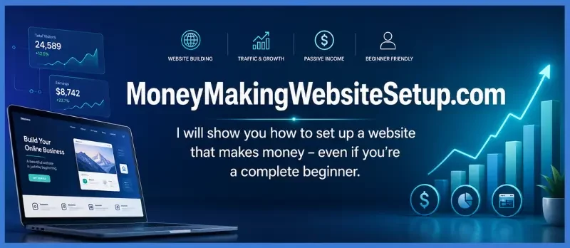
Picture someone opening your new website on a phone while waiting for coffee. They came looking for an answer. The menu is tiny, the text runs edge to edge, and a signup box covers the paragraph they were trying to read.
They probably will not wait for the desktop version to make sense. They will leave.
That small moment is why mobile design belongs at the beginning of a website project. It is also only one part of the job. A site needs a real audience, useful content, and a clear way to earn. Put those pieces together, and you have a foundation that can grow into a business. None of them, on their own, guarantees traffic or income.
Quick answer: Choose a specific audience and a realistic revenue model, build a responsive website, publish helpful content, make the next step easy on a phone, and track what visitors do. Begin with a simple setup. Add tools as your needs become clear.
What makes a mobile-friendly website capable of earning?
A mobile-friendly website adjusts to different screen sizes so people can read, navigate, and take action without pinching, zooming, or wrestling with the layout. A money-making website connects that useful experience to a legitimate revenue path: perhaps a service, digital product, affiliate recommendation, advertising, or email list that supports a relevant offer.
Think of these as two sides of one project. Responsive design makes the site easier to use. The business model gives it a way to earn. A beautiful layout without a useful offer may not generate revenue. A strong offer on a site that is hard to use can lose the visitor before they reach it.
For a beginner, the path is manageable:
- Choose an audience and a problem you can help with.
- Pick one revenue path to start.
- Build a responsive site with the essential pages.
- Publish content that answers real questions.
- Give visitors a clear, phone-friendly next step.
- Measure what happens and improve the weak spots.
Google uses the mobile version of a site’s content for indexing and ranking. It recommends responsive design as an approach that is easier to implement and maintain, which makes mobile testing part of the setup—not a finishing touch. developers.google.com
Step 1: Choose the reader before you choose the theme
It is tempting to begin with colors, logos, or a domain search. Start instead with the person you want to help. “People who want to make money online” is a crowd. “Beginners who want to create their first affiliate website without getting lost in technical details” is an audience you can picture and write for.
Try completing this sentence:
This website helps [audience] solve [specific problem] with [type of help].
For example: “This website helps first-time website owners plan a simple, mobile-friendly site and understand beginner-friendly ways it may earn income.”
Now imagine that reader sitting with their phone, trying to make a decision. What are they worried about? What would they search before they spend money or commit a weekend to the project?
- What does a basic website cost?
- Which platform can I manage as a beginner?
- What pages do I need before launch?
- How can I get visitors without paying for ads?
- What are realistic ways for a small website to earn?
Those questions can guide your first articles. More importantly, they give the site a center of gravity: each page helps the same kind of reader move toward the same kind of goal.
Step 2: Decide how the website could earn
A new website does not need five revenue streams. It needs one sensible model to test. Choose an approach that fits both the audience and the way you want to work.
| Revenue model | How it works | A useful fit when… |
|---|---|---|
| Affiliate marketing | You recommend a relevant product or service and may earn a commission from qualifying purchases. | Readers need help comparing or choosing a solution. |
| Services | You sell work such as setup, consulting, design, or coaching. | You can solve a defined problem directly for clients. |
| Digital products | You sell a guide, template, course, or other downloadable resource. | You can turn useful knowledge into something people want. |
| Advertising | You earn from ads shown to visitors. | You have enough suitable traffic and can keep ads from disrupting the experience. |
| Email-based offers | Visitors choose to receive helpful emails, and relevant offers appear in the sequence. | You can provide ongoing guidance and make recommendations that fit it. |
If your first conversion will be an email signup, make the invitation worthwhile. Offer a practical resource, say what subscribers will receive, and deliver on that promise. The article should still answer the reader’s question; the signup is a natural next step, not a locked door.
If you use affiliate links on your site or in email, explain the relationship clearly and follow the rules that apply to your audience and location. Keep recommendations relevant and describe them honestly.
Step 3: Choose a platform that fits the work you want to do
Your domain is the address people use to find your website. Choose something easy to spell, remember, and connect to your topic. A clear, workable name is better than putting off the whole project while searching for a perfect one.
Then choose how to build the site:
- Hosted website builder: Hosting and visual editing are usually part of the service. This can suit someone who wants a simpler setup.
- Self-hosted WordPress: You choose a hosting provider and manage the WordPress installation. It gives you flexibility, with more setup and maintenance to handle.
Look past the first price you see. Compare renewal costs, backups, security, support, storage, email features, and how easily you can move your content if you need to.
The essentials at launch are usually modest:
- A domain name
- A website platform and hosting plan, if separate hosting is needed
- A responsive theme or template
- HTTPS security
- A way to publish and update pages
- A way to collect and deliver emails, if that is your plan
A custom design, premium logo package, and stack of paid plugins can wait until you know what problem they would solve. You do not have to buy your way into feeling ready.
Step 4: Design for the thumb, not just the screen
A responsive website uses the same page content while arranging it to fit different screens. Start by checking the phone layout. Then confirm that the desktop version still looks right.
Make the words easy to read
Use legible text, clear contrast, descriptive headings, and short paragraphs. Long instructions are easier to follow when you break them into steps. Put the central answer near the beginning so visitors can quickly tell they have found the right page.
Make the menu and buttons easy to tap
Keep navigation short and use familiar labels. Make buttons visible and comfortable to tap. Give them specific wording: “Download the checklist” tells people what happens next; “Click here” leaves them guessing.
Keep forms short and testable
Ask for only the information you need. On a phone, complete every field yourself. Check the submit button, confirmation message, and email delivery. If an email signup is central to your plan, a form that is hard to use can interrupt the entire path.
Let people read before you interrupt them
Resize images for the space they occupy. Avoid pop-ups that cover the content or make the page difficult to close. A call to action should be easy to find, but the visitor should not have to fight through it to read the article.
Google recommends responsive design and advises site owners to keep important content equivalent between mobile and desktop versions. developers.google.com
Step 5: Give the site enough trust and structure to feel real
A new site does not need a huge library before it can launch. It does need enough information for a visitor to understand who the site serves, find help, and decide what to do next.
Start with these pages:
- Home: Tell visitors who you help and what they can learn or do.
- About: Explain the site’s purpose and the experience or approach behind it.
- Contact: Give readers a clear way to reach you.
- Privacy: Explain how the site handles visitor information, especially if you collect email addresses or use analytics.
- Affiliate disclosure: If you have affiliate relationships, make the disclosure easy to find and understand.
- Core guides: Answer the questions your audience is most likely to ask.
The pages should feel like parts of the same site. When a visitor moves from a guide to your About page or signup form, the design and message should still make sense together.
Step 6: Write for the question that brought the reader here
A page can attract the right kind of visitor when it answers the question they actually came to solve. Begin with a small, connected set of topics instead of unrelated articles published just to make the site look bigger.
For each article:
- Decide on one main question.
- Answer it near the beginning.
- Explain the steps, options, or trade-offs the reader needs to make progress.
- Link to another guide when it helps with the next question.
- Offer a relevant next step, such as a checklist, calculator, or email resource.
A guide to building a mobile-friendly site might link to a website startup cost calculator, a guide to choosing a website topic, or an article about building an email list without spamming. Use link text that lets readers know what they will find on the other page.
Use the words that belong in a real explanation: website builder, responsive design, mobile layout, domain, hosting, signup form, affiliate link, email sequence, and website traffic. Do not repeat the same phrase in every heading. Readers need a clear guide, not a paragraph that sounds like a keyword list.
Step 7: Give the visitor a natural next move
When someone reaches the end of a useful page, make the next step clear. Depending on your business model, that could be joining an email list, asking about a service, viewing a relevant product, or buying a digital resource.
If you invite readers to subscribe, be specific about the benefit. For example:
Get the free 24-hour website blueprint to plan your topic, essential pages, and first revenue path.
Place the invitation where it fits—perhaps after you have delivered the core answer. Make the form easy to use on a phone, tell readers what they will receive, and leave the choice with them.
If your business earns through offers in a welcome sequence, plan that sequence before adding the form. The first email should deliver the promised resource. Later emails can help subscribers use it and introduce relevant recommendations. Done well, the sequence feels like the conversation is continuing.
Step 8: Run the mobile and search checks before launch
Before you share the site, check a few essentials:
- Important pages are public and not accidentally marked noindex.
- Each page has a descriptive title and useful meta description.
- Headings put the sections in a logical order.
- Internal links work and lead to relevant pages.
- The site uses HTTPS.
- The mobile version has the same essential content and links as desktop.
- Forms, downloads, and calls to action work on a phone.
- You have verified the site in Google Search Console and submitted a sitemap if appropriate.
Open the key pages on a real phone. Tap the menu, read a long article, fill out the form, and follow the confirmation link. If something feels awkward or slow, address that obstacle before worrying about a perfect score.
Core Web Vitals measure loading performance, responsiveness, and visual stability. Google’s current guidance lists good targets of LCP within 2.5 seconds, INP below 200 milliseconds, and CLS below 0.1. These measures can help diagnose user experience; they are not a ranking promise, and page experience involves more than one score. developers.google.com
For AI Overviews and other AI search features, Google says the usual SEO fundamentals still apply and no special AI markup is required. Clear, useful answers can help both readers and search systems understand a page, but publishers cannot force a featured snippet or guarantee inclusion in an AI summary. developers.google.com
Step 9: Let early data point to the next improvement
A site can be live for a while before search traffic becomes meaningful. That is why it helps to watch both visibility and action. The data can show whether a page is hard to find, hard to choose in search results, or hard to use once someone arrives.
In Google Search Console, keep an eye on:
- Impressions: Are pages starting to appear for relevant searches?
- Queries: What are people searching when they see your pages?
- Clicks and click-through rate: Are searchers choosing your result?
- Average position: Is visibility changing for the queries that matter to you?
In analytics or your email platform, look at:
- Which pages visitors reach
- Whether they move toward the signup or offer
- How often they complete the action
- Whether the form and confirmation flow work
- Which content seems to support signups or sales
If a page gets impressions but few clicks, review its title and description. If it attracts visitors but few signups, check whether the offer fits the article and whether the form is comfortable on a phone. If the page is hard to find, strengthen the content and links from related pages.
Change one thing at a time. It is easier to learn what helped when you do not rebuild the whole site between checks.
A first-month plan that keeps the project moving
Week 1 — Decide and set up. Choose your audience, topic, revenue path, domain, and platform. List the essential pages and decide what you want visitors to do.
Week 2 — Build for mobile. Set up the responsive layout, navigation, core pages, and signup form. Add privacy and disclosure information where relevant. Test the key tasks on a phone.
Week 3 — Publish connected content. Create a core guide and a few supporting pages around related audience questions. Link between them where it helps a reader.
Week 4 — Check and adjust. Verify Search Console, review indexing and performance, test the signup flow, and look at any early query or visitor data. Let what you learn shape the next step.
The aim is a working foundation and a clearer picture of what your audience needs—not proof that the site will become profitable by a certain date.
Questions a new website owner might ask
“I can’t code. Can I still make the site mobile-friendly?”
Yes. Many website builders and WordPress themes offer responsive layouts without requiring you to write code. Still, open the finished pages on a phone. Images, forms, and pop-ups can behave differently from the template preview.
“Can I build the whole thing on my phone?”
Some platforms let you edit from a phone, but writing and checking a full site is usually easier on a larger screen. Whichever device you use to build it, test the finished site on a real phone before launch.
“What are my options for earning from a website?”
Common options include affiliate commissions, services, digital products, advertising, and email-based offers. Choose one that fits your audience and explain recommendations honestly. None guarantees income; results depend on demand, useful content, relevant offers, and consistent work.
Recommended guide: How to Earn Passive Income From a Website: The Complete Step-by-Step Blueprint That Keeps Making Money While You Sleep
“How much money do I need to start?”
That depends on the platform and services you choose. A basic site may need a domain and a platform or hosting plan. Check renewal prices and optional extras before paying. If you cannot name the problem a tool solves, it can probably wait.
“When should I expect the site to earn?”
There is no dependable fixed timeline. A new site needs useful content, visibility, and an offer people want. Search traffic and income can take time to develop, and some sites never become profitable. Track what is happening and use the evidence to guide your next move.
Products / Tools / Resources
You do not need every tool on day one. Choose what supports the next step you are actually taking.
- Website platform: WordPress with a responsive theme or a hosted website builder. Compare ease of use, ongoing costs, and how easily you can move your content.
- Domain and hosting: Choose a clear domain and a plan that covers the basics, including HTTPS, backups, and support.
- Google Search Console: Check which pages are indexed and what searches are bringing impressions and clicks.
- PageSpeed Insights and Core Web Vitals: Find performance issues that may make key pages frustrating on a phone.
- Email service: If your site uses a subscriber funnel, choose a provider that can manage signup forms, confirmations, delivery, and follow-up messages.