
A handful of useful links can make a reader’s next step easier. A handful of unexplained links can leave them wondering where to start.
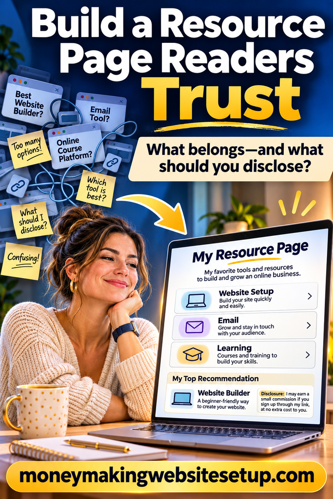
That difference is what makes a resource page worth building. It gives readers one place to find tools, services, and guides—and enough context to decide what fits. The page doesn’t have to be elaborate. It does need to be clear about why each recommendation is there, who it may help, and whether you could earn a commission.
Quick answer: Organize your website resource page around what readers are trying to do. Use clear categories, consistent criteria, honest descriptions, and visible affiliate disclosures. Check the links and details regularly so the page stays useful.
What makes a resource page different from a link list?
A website resource page brings together tools, services, guides, or other recommendations for a particular audience. For a site about building an online business, that might mean categories for setting up a website, collecting email subscribers, learning marketing basics, and understanding website performance.
The page’s job is to help a visitor choose a next step. That’s what separates it from a bare list of links. A recommendation should come with enough explanation for someone to understand what it does, who it may suit, and what to consider before clicking.
It’s also different from a product review. A review looks closely at one product. A resource page helps readers navigate several resources or find the right starting point.
Get a Complete Money-Making Website Built For You - Free
Begin with the reader’s problem
It’s tempting to start by listing every tool you know. Start with the reader instead.
What are they trying to do? A new blogger may be choosing a website platform. Someone with a site already running may need an email service or a better way to track performance. Those are different needs, even if both people are interested in online business.
Before you choose categories, jot down:
- Who the page is for: new bloggers, experienced site owners, or another defined audience
- What they want to accomplish: build a site, create content, grow an email list, or manage a business
- What could constrain their choice: budget, technical experience, or available time
- What would help them move forward: a comparison, a tutorial, or a link to a provider
This small bit of planning keeps the page from becoming a catch-all. If a resource doesn’t help the intended reader, it may not belong there.
Decide what earns a recommendation
Readers shouldn’t have to guess why one resource made the page and another didn’t. Choose a few fair criteria and apply them consistently.
Depending on the type of resource, you might consider:
- What it helps a reader do
- Who it is designed for
- Cost and any important pricing conditions
- How much effort it takes to get started
- Available support or learning materials
- Limitations, trade-offs, or cases where another option may be a better fit
You don’t need to crown a universal winner. Explain what a resource may be suited to and why. One option might make sense for a beginner who wants a simple setup; another might suit someone who needs more control. The useful part is the explanation.
Be just as clear about the evidence behind a recommendation. If you’ve used a product, describe what you personally experienced. If you haven’t, say what you verified and avoid language that suggests hands-on testing. Keep provider claims distinct from your own observations.
Google’s people-first guidance encourages content that is helpful and reliable, with clear sourcing and enough detail to help readers accomplish their goal. That’s a sound standard for recommendations, too: tell readers what you know, and don’t imply more experience than you have.
Organize the page around useful choices
A good category name reflects what the reader needs, not just the company that sells the product. For a website-building resource page, categories might look like this:
| Category | What the reader is trying to do | Details that may help them compare |
|---|---|---|
| Website setup | Choose how to build and host a site | Setup effort, flexibility, cost |
| Email marketing | Collect and contact subscribers | List management, automations, pricing |
| Website growth | Understand and improve site performance | Reporting, learning curve, use case |
| Learning resources | Build skills or solve a specific problem | Topic, format, level of detail |
If the page has several sections, add a short table of contents near the top. A comparison table can help visitors scan the main differences, while fuller descriptions below it give them room to consider the trade-offs.
Don’t add categories just to make the page look more complete. A few clear sections are often easier to use than a long directory with overlapping labels. If visitors can’t tell where a resource belongs, they’ll have a harder time deciding what to do with it.
Give each recommendation enough context
A consistent format makes options easier to compare. It also helps you spot what’s missing from a description. Adapt this simple template to your topic:
[Resource name]
May suit: [Reader, task, or situation]
What it helps with: [Plain-language description]
Why it’s included: [Your reason or a relevant verified detail]
What to consider: [A useful limitation or trade-off]
Next step: [A clear link label]
Imagine you’re describing an email marketing service. Instead of calling it “great for everyone,” explain what job it may help with, what kind of site owner might consider it, and what details to check before signing up. That gives readers something to compare against their own needs.
Make link labels clear, too. “View the provider’s plans” tells a reader more than “Click here.” The label should set an honest expectation about what happens next.
Make the affiliate disclosure easy to understand
If a reader’s purchase may earn you a commission, explain that plainly. A visitor shouldn’t have to search your About page or interpret a vague label to understand the relationship.
For U.S.-facing affiliate marketing, Federal Trade Commission guidance says the relationship should be disclosed clearly and conspicuously. It recommends placing the disclosure close to the recommendation when possible, and notes that “affiliate link” by itself may not tell readers that you can earn money from a purchase. Requirements can differ by jurisdiction, so check the rules that apply to your audience and business.
For example:
Disclosure: Some links on this page are affiliate links. If you buy through one, I may earn a commission. This does not change the price you pay.
Use the last sentence only if it accurately describes your affiliate arrangements.
Put the disclosure where a reader can see it in connection with the recommendations. On a long page with several categories, repeating a brief disclosure near relevant sections can make the relationship clearer. A small “Affiliate Disclosure” link in the footer may not tell readers what they need to know before they act.
Give paid links the right attributes
A visible disclosure is for readers. A link attribute helps communicate the nature of a link to search engines. They have separate jobs.
Google recommends marking affiliate links with rel="sponsored". It still accepts nofollow for this purpose, but prefers sponsored. If you use an affiliate plugin or your website builder adds link attributes automatically, check the link itself to confirm it’s working as intended.
<a href="https://example.com" rel="sponsored">View the provider’s plans</a>The link attribute doesn’t replace the words on the page. Readers still need a clear explanation of a commission or other relevant relationship.
Help readers find the next useful page
A resource page can connect people with the rest of your site, too. Link to it from relevant tutorials and guides, then link out from the resource page to articles that explain how to choose or use a recommendation.
For example:
- From a website setup guide: “See the website tools and services I recommend.”
- From an email marketing tutorial: “Compare email tools for a new website.”
- From a website cost guide: “Review resources that may fit your budget.”
Choose anchor text that describes the destination. The link should help a reader understand what they’ll find—not repeat a keyword for its own sake.
Keep the page current
A recommendation that was useful last year may need another look today. Providers can change their prices, features, availability, or terms. A short maintenance routine can catch details that might otherwise mislead a reader.
When you review the page, check:
- Do the links still work and lead to the expected destinations?
- Are the descriptions still accurate?
- Have prices or important features changed?
- Does each recommendation still suit the audience you named?
- Are the disclosure and link attributes still present?
- Is the page easy to read on a phone?
Change the “reviewed” or “updated” date only after you’ve actually checked or revised the content. A date is helpful when it reflects real work; by itself, it doesn’t show that the details are current.
Make the page easy to scan
Use a descriptive title, a brief introduction, and headings that name the reader’s task. Short explanations, jump links, comparison tables, and recommendation cards can all make a page easier to navigate.
These choices help readers find information; they don’t guarantee a featured snippet or an AI search citation. Google says its AI search features use the same foundational SEO practices as Search overall. It also says there’s no special schema markup required for AI Overviews or AI Mode, and structured data should match what people can see on the page.
An FAQ can answer real follow-up questions. Write it for people who want those answers, not to repeat variations of the same keyword. Google’s systems select featured snippets automatically; there isn’t a special tag that makes a page one.
Questions readers may have
How many recommendations should I put on the page?
Enough to help readers with the page’s purpose. There’s no single ideal number. Too few options may leave an important need unanswered; too many can make the page harder to navigate and keep current.
Can I recommend a product I haven’t tried?
You can describe information you’ve verified, but be clear about what you haven’t personally tested. Don’t present provider claims as your own experience, and don’t suggest you compared options you haven’t reviewed.
Where should I put the affiliate disclosure?
Put it somewhere readers can notice it in connection with the recommendation or link. On a long page, a brief disclosure near the start and reminders by relevant sections may make the relationship easier to understand. The right approach depends on the page and the rules that apply to your audience.
Does a resource page need schema markup?
Clear headings, tables, and FAQs can help people navigate the page. There’s no special markup that guarantees a featured snippet or an AI search appearance. If you use structured data, make sure it accurately describes visible content.
Products / Tools / Resources
You can put together a useful resource page without buying a new tool. Start with a few simple building blocks:
- Your existing website editor: Use it to create clear category headings, jump links, and recommendation sections.
- A comparison worksheet: A spreadsheet or document can help you record each resource’s audience, purpose, selection reason, limitations, cost details to verify, and last review date.
- A disclosure statement: Keep plain-language wording handy, then place it where visitors can see it near relevant recommendations.
- A link review checklist: Track the destination, link status, affiliate attribute, and last check for each recommendation.
- An internal link map: Note which tutorials should point to the resource page and which guides the resource page should lead readers toward.