
A page can feel perfectly clear on a laptop and oddly difficult on a phone. The headline fits. The menu behaves. The button is easy to spot. But on a smaller screen, the same page may make visitors pinch to read, scroll past the useful part, or wonder what a button will open.
That friction adds up. A reader who came looking for a recommendation may leave before they reach it—not because they weren’t interested, but because the page made the next step feel like work.
To improve mobile conversions on an affiliate website, start with the visitor’s path: make the page load smoothly, put the useful answer near the top, make recommendations easy to compare, and explain what happens when someone taps an affiliate link. Then measure each step, from page visit to click to any sale the affiliate program reports.
In brief: Make your mobile page easy to read, trust, and use. Choose one main action, make it clear and comfortable to tap, and track it separately from affiliate sales.
First, decide what a “conversion” means on this page
A conversion is simply the action you want a visitor to take. On one page, that might be an affiliate link click. On another, it might be an email signup, a guide download, or a different next step in your funnel.
Those actions happen at different points in the visitor’s journey. An affiliate click does not mean a purchase happened, and an email signup is not a sale. If you measure all of them as one thing, it becomes hard to tell where the page needs work.
Choose the main goal for each page before changing its design. That decision will help you focus the copy, place calls to action where they make sense, and measure results more accurately.
12 ways to make your mobile affiliate page easier to act on
1. Help the page settle quickly
A visitor opens your page while waiting for a bus, standing in a shop, or switching between apps. If the main content takes too long to appear—or jumps around while loading—they may leave before they understand what you offer.
Start with the heaviest images and any scripts, fonts, or widgets that slow down the page. Look for layout shifts too: few things are more irritating than trying to tap a button just as it slides somewhere else.
Google’s Core Web Vitals measure loading, responsiveness, and visual stability. Its “good” thresholds are an LCP of 2.5 seconds or less, an INP below 200 milliseconds, and a CLS score of 0.1 or less. Treat these as useful experience targets, not a promise of better rankings or sales.
Try this: Open the page on a phone and watch for when the headline, main content, and first useful link appear. Check field data in Search Console as well as a speed-testing tool.
2. Let readers know they’re in the right place
Visitors shouldn’t have to wade through a long introduction before learning what a page will help them decide. Begin with the answer or recommendation, then give a little context: who it may suit, and what the reader should look at next.
A review, for example, might open by naming the kind of person who could benefit, the product’s main advantage, and one limitation to consider. A reader who wants more detail can keep going. Someone looking for a quick answer can make an informed choice.
Try this: Look at the first screen on a phone. Can a new visitor tell what the page covers, who it is for, and what to do next?
3. Give long content room to breathe
On a phone, a dense paragraph can fill the whole screen. A wall of text is easy to abandon, even when the information inside it is useful.
Use descriptive headings to break up the page where the subject changes. Keep paragraphs focused, and use lists when they make steps or options easier to compare. Explain unfamiliar terms as they appear. The goal is a comfortable reading rhythm—not a page chopped into one-line fragments.
Try this: Scroll through the page without reading every word. Do the headings alone make it clear what the article explains and where the useful details are?
4. Make the next useful page easy to find
A reader may want to check a related guide, compare another option, or understand the disclosure before clicking. If the only path is back to the search results, the site isn’t helping them continue.
Use internal links with descriptive wording. “Read the mobile launch checklist” tells a visitor more than “click here.” Keep menus manageable and make sure regular links are easy to recognize.
Try this: Ask someone unfamiliar with the page to find the comparison, cost details, or next step. Notice where they pause or get lost.
5. Make links and buttons comfortable to tap
A small button surrounded by other links can be difficult to select on a phone. Give important tap targets enough room, use clear contrast, and leave space between nearby buttons.
Pay attention to ordinary text links too. If they’re tightly packed, a visitor may tap the wrong one—or decide they’re not worth the trouble.
Try this: Hold a phone in one hand and test the page. Can you tap the main action without zooming in or accidentally opening something nearby?
6. Tell visitors what a button will do
“Learn more” can work when the destination is obvious. When it isn’t, clearer wording helps visitors decide whether they want to tap.
Match the button text to the page it opens. “View the current plan details” gives a better sense of the next step than “Go here.” Keep the promise honest: don’t imply there’s a discount, feature, or offer on the other side unless there really is.
Try this: Read the button text by itself. Would a visitor know what the link opens?
7. Put affiliate links beside the information that matters
A link is most useful when it appears near the point where a reader can make a decision. That may be after a comparison, a feature explanation, or a short recommendation—not necessarily at the very end of the article.
There’s no need to place the same button after every paragraph. Too many prompts can make a page feel pushy and distract from the information that supports the recommendation.
Try this: Find the moment when a visitor has enough information to consider the product. Make the next step visible there, while leaving room for readers who need more detail.
Recommended reading: How to Monetize a Mobile-Friendly Website with Affiliate Links: A Beginner’s Roadmap from Useful Pages to Tracked Commissions
8. Make comparisons readable without sideways scrolling
A wide table may look tidy on a laptop but become awkward on a phone. Visitors can end up scrolling sideways, losing track of which column belongs to which product, or giving up on the comparison.
Keep the criteria focused on what changes the decision. Depending on the number of products, stacked cards or a short list may be easier to use than a conventional table. If a table is still the clearest option, make sure product names, prices, and limitations remain easy to follow at narrow widths.
Try this: Check the comparison without zooming. Can a reader match every price, feature, and limitation to the right product?
9. Earn trust with specific, honest details
Readers need to understand why you recommend something. Explain the criteria behind your recommendation, what the product does well, and where it may not be a good fit. Be clear about whether details come from firsthand experience or research.
Place a plain affiliate disclosure where readers can see it before or near the first affiliate recommendation. If you may earn a commission from a link, say so clearly—and describe any “no extra cost” arrangement only if that is accurate.
A candid limitation can help readers decide whether a product fits their needs. A page that mentions only advantages leaves them with more unanswered questions.
Try this: Review the page for claims that sound certain but aren’t supported. Add context or remove claims you can’t verify.
10. Clear space for the page’s main purpose
Popups, sticky banners, ads, and competing buttons can crowd a phone screen quickly. A signup form that covers the answer or a banner that blocks a recommendation may interrupt the very decision you want to help with.
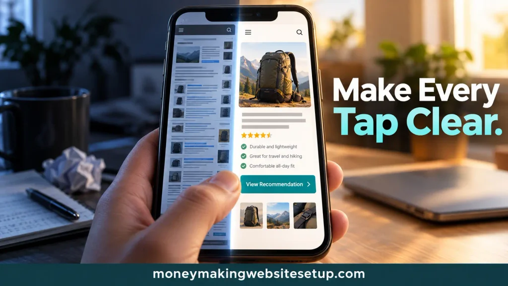
If you use promotional elements, make sure they don’t obscure the main content. Keep the page’s purpose easy to see and give visitors a clear way to close any overlay.
Try this: Look at the first two screens on a phone. How many elements are asking for attention? If several compete with the article’s main goal, simplify the page.
11. Follow the visitor’s path, one step at a time
A single conversion rate can hide where people are dropping off. Track the measures available to you, such as:
- Mobile page visits
- Email signups or other actions on your site
- Outbound affiliate link clicks
- Sales or commissions reported by the affiliate program
For example, you can calculate an outbound click rate by dividing affiliate-link clicks by relevant page visits, using the same definition consistently. If your affiliate program reports both clicks and sales, you may be able to compare those steps too.
The numbers won’t always match exactly. Your site analytics and the affiliate program may count different events, use different reporting windows, or apply different attribution rules. Treat them as separate views of the visitor’s path.
Try this: Compare mobile and desktop for the same page and time period. If they differ sharply, check traffic sources and the amount of data before deciding what caused the gap.
12. Change one thing, then see what happens
When a page isn’t working, it’s tempting to change the headline, button, layout, and recommendation all at once. But if the numbers move afterward, you won’t know which change made a difference.
Start with one clear observation and one adjustment. For example: “The button doesn’t explain what happens next, so I’ll make its label more specific.” Give the change enough time to collect useful data, and don’t treat a handful of clicks as proof of a lasting result.
Try this: Keep a simple note with the page, the change, the date, and the measure you’re watching. Once you understand what happened, decide what to test next.
Why the mobile version deserves its own review
A desktop page viewed through a responsive layout may still have mobile problems: small tap targets, crowded comparisons, hidden content, or buttons that sit far from the information they relate to.
There’s also a search reason to check carefully. Google uses a site’s mobile version as the basis for indexing. Important content and clear headings should remain available there, even if the mobile layout arranges them differently.
Questions readers often ask
“People click my affiliate link, but they don’t buy. What’s wrong?”
The purchase takes place on the merchant’s site, so the problem may be outside your page. Visitors could be comparing prices, looking for more information, or deciding the product isn’t right for them. Make sure your recommendation sets accurate expectations, then check the reports your affiliate program provides to see what happens after the click.
“Should I put an affiliate button at the top of every page?”
Not automatically. A button beside a short summary can help a visitor who is already ready to act. But the button should not replace the information someone needs to make a decision. Let the page’s subject and the reader’s intent guide its placement.
“Do mobile affiliate pages need to be shorter?”
Not necessarily. They need to be easy to use on a phone. Keep useful details, then organize them with clear headings, focused paragraphs, and comparisons that fit the screen. Google advises that important content remain available on mobile for indexing.
“Will a faster page guarantee more sales?”
No. A smoother page can remove one source of friction, but sales also depend on the visitor’s needs, the offer, the merchant’s site, and the affiliate program’s tracking. Measure the parts of the journey you can see.
“Do I need special schema to appear in an AI summary or featured snippet?”
There’s no special markup that guarantees either. Google says its systems choose featured snippets, and its guidance for AI features does not require special AI schema. Focus on useful content, clear organization, and sound technical SEO.
Products / Tools / Resources
These tools can help you check different parts of the mobile visitor’s experience:
- Google PageSpeed Insights: Check performance and get suggestions for improving loading and responsiveness.
- Google Search Console: Review search performance and available Core Web Vitals data.
- Google Analytics: If you’ve configured the relevant events, use it to examine on-site actions such as outbound clicks or signups.
- Your affiliate program’s reporting dashboard: Check the clicks, sales, or commissions the program makes available.
- A real smartphone: Test the page with your own hands. It’s the quickest way to notice a button that’s hard to tap or a comparison that’s hard to follow.