
Your website has looked finished on your computer for days. Then you open it on your phone and notice the menu is fiddly, the signup box covers half the screen, and the button you need is nowhere to be seen.
That is exactly why it helps to test your website on a real phone before launch. A page can look polished in an editor and still make a visitor work too hard to read, navigate, trust it, or take the next step.
Quick answer: Open your published website on a real phone. Test the layout, text, menu, images, links, calls to action, forms, and complete signup or purchase flow. Then check page speed and confirm that Google can access the mobile page. Record each result as Pass, Fix, or Not applicable, and retest after making changes.
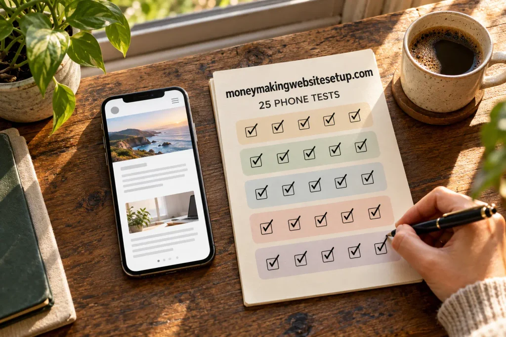
This checklist covers 25 tests, from the first tap to Google’s view of your published page.
If you’re still building the site itself, start with building a mobile-friendly website that makes money. This checklist is for the last round of checks before you send visitors there.
Before you begin: set up a useful test
Use a real smartphone if possible. A website builder’s preview is handy, but it can’t show you exactly how the page behaves on your device, browser, connection, or keyboard.
Have these ready:
- Your phone and charger
- Wi-Fi and mobile data, if available
- A second phone or browser for another check
- A test email address you can access
- A notes app or checklist to record problems
- Search Console or a similar tool for checking the published page
If your website accepts payments, use the platform’s test mode where available. For affiliate links, make sure the destination is correct; don’t make a purchase through your own link unless the program allows it.
First impressions: layout and navigation
1. Open the published page on your phone
Visit the live page, not just the editor preview. Look for an error message, blank section, or unexpected redirect.
Pass if: The correct page opens and the main content appears.
2. Check portrait and landscape views
Hold your phone upright, then turn it sideways. Most people browse vertically, but a page should still be usable if someone rotates their phone.
Pass if: Text, images, and controls remain visible in both orientations.
3. Look for sideways scrolling
Try dragging the page left and right. Wide tables, images, or embedded forms can extend beyond the screen and force visitors to scroll sideways.
Pass if: The page fits the screen width. Ordinary text shouldn’t require horizontal scrolling.
4. Read a full paragraph without zooming
Read a few paragraphs at your normal phone distance. Notice whether the text is too small, faint, cramped, or stretched across the full width of the screen.
Pass if: You can read comfortably without pinching to zoom or losing your place.
5. Tap links and buttons without hitting the wrong one
Try the menu, text links, and calls to action. If two controls sit close together, you may find yourself opening the wrong one.
Pass if: You can tap the control you intend to use.
6. Check the header, pop-ups, banners, and sticky elements
Look for cookie notices, promotional bars, pop-ups, ads, or sticky buttons. Try closing each one. Check whether anything blocks the page or makes it hard to reach the main controls.
Pass if: Visitors can read the page, close notices, and reach important links without fighting overlays.
7. Open and close the navigation menu
Tap the menu icon, try the important links, and then close the menu.
Pass if: The menu opens, its labels make sense, the links work, and it closes easily.
Content and the page itself
8. Check that the page explains itself near the top
A visitor shouldn’t have to scroll through several screens to work out what the page is about or whether they’re in the right place.
Pass if: The title and opening make the topic clear.
If the site serves a particular audience, say so. For guidance on choosing a focus, read our guide about choosing a niche that actually converts.
9. Scan the headings and paragraph breaks
Scroll through the page at a natural reading pace. Do the headings make it easy to find the section you need? Are there paragraphs that feel difficult to read on a small screen?
Pass if: You can scan the page and find the main sections without effort.
10. Compare the main mobile content with desktop
If your site has separate mobile and desktop versions, make sure the phone version includes the same important text, links, titles, and images.
Google uses the mobile version of a site’s content for indexing and ranking. It recommends responsive design because it is easier to implement and maintain. developers.google.com
Pass if: Nothing important disappears when you view the page on a phone.
11. Test accordions, tabs, and content that appears as you scroll
Open expandable sections and tabs. Scroll down to see whether images and other content load. Check that a visitor can reach important information and that it doesn’t depend on a broken interaction to appear.
Google advises site owners not to make primary content load only after an action such as clicking or swiping. developers.google.com
Pass if: The content appears and can be read or opened as intended.
12. Check images, captions, and alternative text
Look at every important image. Is it blurry, oddly cropped, or much larger than it needs to be? Does its caption make sense in the mobile layout?
Pass if: Images display clearly and support the surrounding content. Add descriptive alt text to informative images; use empty alt text for decorative images when appropriate.
13. Play videos and audio
If the page includes a video or audio player, start it, pause it, and check the controls. Make sure it doesn’t stretch beyond the screen or cover nearby content.
Pass if: The media loads and the controls work on your phone.
14. Follow internal and external links
Tap the links that matter. Internal links should lead to the guide they describe; external links should reach the intended destination.
Pass if: The links work and their wording gives visitors a fair idea of where they lead.
15. Check the main call-to-action wording
Find the main button or link. Does it explain what happens when you tap it?
Pass if: The wording is specific. “Download the checklist” sets a clearer expectation than “Click here.”
16. Check where the call to action appears
Look at the top, middle, and bottom of the page. Visitors should be able to find the next step, but they shouldn’t have to push past a button every few paragraphs.
Pass if: The call to action is easy to find and doesn’t interrupt the reading experience.
17. Follow the call to action to its destination
Tap the button or link. Check that it leads to the page or form it promised and that the destination opens securely.
Pass if: The link reaches the right place without a broken redirect or surprise destination.
Forms and the path to action
18. Complete every form field on your phone
Try your email signup, contact form, inquiry form, or checkout fields. Check the labels, field order, and keyboard. An email field should be easy to fill in; a number field should bring up a suitable keyboard when possible.
Pass if: You can complete the form without awkward zooming, horizontal scrolling, or confusing labels.
19. Submit the form with an error, then with valid information
Try submitting the form with a required field left empty. Then complete it correctly. Notice whether the error message explains what needs fixing.
Pass if: Errors are clear, and a successful submission leads to a confirmation or next step.
20. Test the full signup, inquiry, or purchase path
Start at the page’s main call to action and follow the process to the confirmation page. If you collect email addresses, make sure the signup and any confirmation step are understandable.
Pass if: You can complete the intended action on your phone.
21. Check email and resource delivery
Use your test address to sign up. See whether the promised email arrives, the download link works, and the message is readable on a phone.
Pass if: The visitor receives what the form promised and can use it.
Recommended guide: How to Build an Email List from Your Website: The First 100 Subscribers System—Even If You Have Little Traffic
22. Check affiliate links and disclosures, if you use them
Tap each affiliate link and confirm it goes to the intended product or service. Check that the disclosure is easy to find and understand.
Pass if: The links work, recommendations are presented honestly, and the disclosure is visible. If you don’t use affiliate links, mark this test Not applicable.
23. Find the trust and policy information
From your phone, look for the About, Contact, Privacy, and relevant disclosure pages. Check the footer and menu, where visitors may expect to find them.
Pass if: The links are easy to reach and the pages load correctly.
Speed and search readiness
24. Check loading, interaction, and visual stability
Run the page through PageSpeed Insights or another suitable performance tool. If real-user field data is available, review it too. A lab test can help diagnose a problem, but it may not match every visitor’s phone or connection.
Google’s current Core Web Vitals guidance recommends, at the 75th percentile of visits, an LCP of 2.5 seconds or less, an INP of 200 milliseconds or less, and a CLS of 0.1 or less. These metrics describe loading, interaction, and visual stability. Treat them as diagnostic targets, not a promise of rankings. web.dev
Pass if: The main content loads promptly, controls respond, and the page doesn’t jump around while loading.
25. Check Google’s view of the published page
In Google Search Console, use URL Inspection on the live page. Check whether the page can be crawled, and review the rendered result for missing text, blocked resources, or an unintended indexing directive. Confirm that a relevant page on your site links to it.
Pass if: The page is accessible and its important mobile content appears as expected. A successful inspection can help catch technical problems, but it doesn’t guarantee indexing or ranking.
When a test fails, what should you fix first?
Some issues can wait. Others can stop a visitor from using the page at all.
Fix before launch:
- The page fails to load or displays an error
- A key section, form, or button is missing
- A visitor can’t read the text or open the menu
- A call to action leads to the wrong destination
- A signup, inquiry, or payment flow fails
- An overlay blocks the content
Fix soon:
- Images are oversized, blurry, or poorly cropped
- The page jumps while loading
- The menu is confusing
- Forms ask for unnecessary information
- Important links are difficult to find
Improve over time:
- Spacing, colors, and smaller visual details
- Features that aren’t needed for the page’s main purpose
- Optional animations or extra tools
Keep a short log: page, test, result, fix, retest. Where possible, change one thing at a time. That makes it easier to see whether your fix solved the problem.
What a mobile-friendly launch can—and cannot—do
A mobile-friendly website removes avoidable friction. It can make it easier for someone to read, navigate, sign up, contact you, or buy. It can’t create demand for an offer or guarantee traffic, sales, or income on its own.
The same foundational SEO practices apply to Google’s AI features. To be eligible as a supporting link, a page needs to be indexed and able to show a snippet. There is no special schema that guarantees inclusion, and publishers can’t mark their pages as featured snippets; Google’s systems choose them.
Recommended guide: How to Create a Mobile-Friendly Niche Website That Can Earn Income: A Beginner’s Step-by-Step Guide
Questions you may have before launch
“My website builder has a phone preview. Do I still need to use my phone?”
Yes. A preview is helpful, but a real phone can reveal problems with your browser, screen size, connection, keyboard, pop-ups, and form controls.
“If my design is responsive, doesn’t that mean it’s mobile-friendly?”
Not necessarily. A responsive layout adapts to the screen, but buttons can still be hard to tap, text can be difficult to read, forms can fail, and banners can block the content. Test the actual pages and actions.
Recommended reading: Low-Cost, Mobile-Friendly Website Setup for an Online Business: A Beginner’s 7-Step Plan
“The site feels slow. What should I look at first?”
Start with the largest images, heavy embedded content, and scripts or pop-ups that delay the main page. Use a performance tool to find the specific problem, then test again. A score by itself won’t tell you which fix matters most to your visitors.
“Does passing these 25 tests guarantee Google will index my page?”
No. This checklist helps you find common usability and technical issues. Google’s systems decide whether to crawl, index, and show a page. Meeting technical requirements doesn’t guarantee that it will appear in search results. developers.google.com
“Do I need special schema to appear in an AI Overview or featured snippet?”
No special schema guarantees either result. Use structured data only when it accurately describes content that visitors can see and is appropriate for the page. Google’s guidance says no special markup is required for AI features, and its systems select featured snippets. developers.google.com
“How often should I repeat these mobile checks?”
Repeat them after changing your theme, forms, menus, plugins, pop-ups, or page layout. It’s also a good idea to retest the main visitor journey after changing an offer or signup process.
Learn more: Mobile-First Website Setup Checklist for Beginners: Test, Fix, and Launch with Confidence
Products / Tools / Resources
- A real smartphone: Use your own phone for the main check. If your audience uses both iPhone and Android, test on each when you can.
- A second browser or device: Useful for checking whether a problem appears in more than one environment.
- Google Search Console: Use URL Inspection to review the published page and identify crawl or rendering issues.
- PageSpeed Insights: Check performance and review available field data alongside lab recommendations.
- Chrome DevTools or Lighthouse: Helpful for investigating layout and performance issues when you have access to a desktop browser.
- A test email address: Use one you can access to confirm signups, messages, and downloads arrive as expected.
- Your website platform’s preview and test modes: Use the mobile preview while building and test mode for forms or payments where available. Confirm the result on a real phone as well.
- Related site guides: Read our mobile-friendly website setup guide, our website startup cost calculator guide, our guide to choosing a niche that converts, and our guide about building an email list that makes money.